Mobile Design
Mobile Design
The Design Process
-
It all begins with a simple napkin sketch
-
Walking through a user’s journey by sketching flows and looking for pain points
-
Solidify the site map and block the header, navigation, images, text, and buttons
-
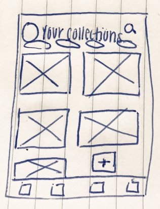
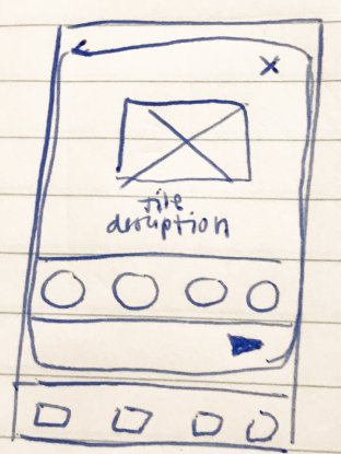
A set of diagrams that consist of simple lines and shapes representing the skeleton of the user interface (UI) and core functionality
-
Put your wireframe to the test! Always test during production
-
Alter design based on results from testing
-
Create a high-fidelity model, and be willing to continue the cycle again
What Is Encourage?
This product is specifically designed for the hearing-impaired. With sections of this application focusing on easy-to-read sections of scripture.
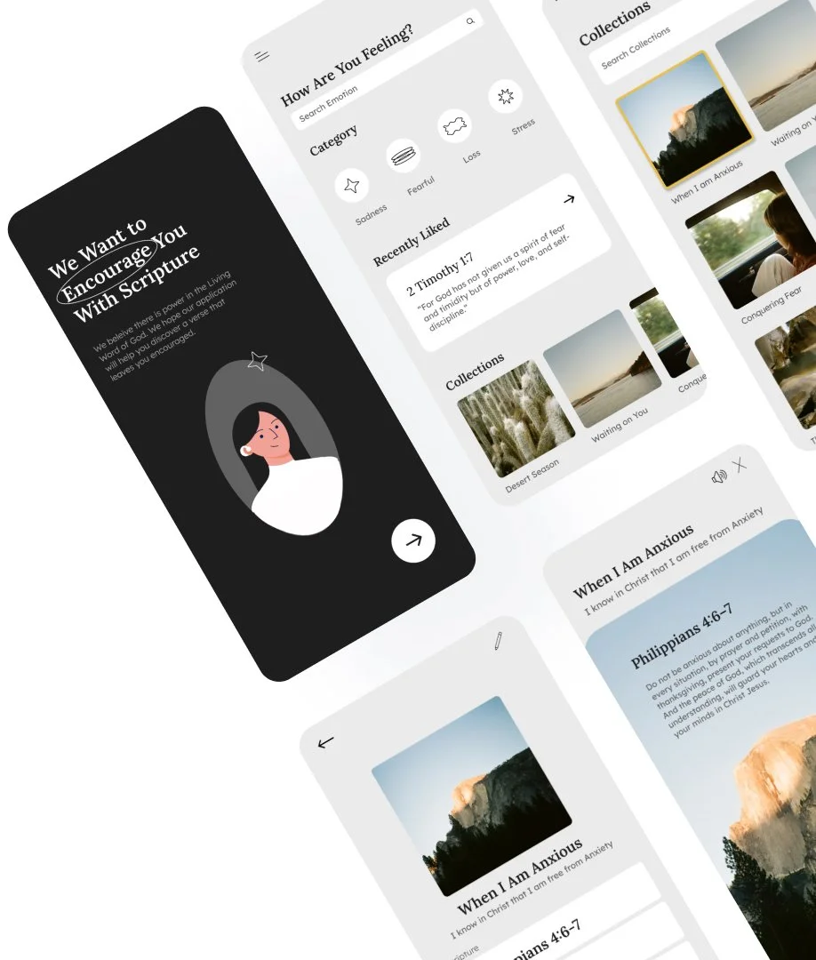
Encourage is a Bible Application that connects scripture with your emotional well-being and encourages you based on mood.
My Role in the project was Lead UX Designer. Peers and potential customers provided feedback throughout the process.
Journey Map
By Journey Mapping, I begin to understand the user's most possible flow pattern through an application.
Information Architecture
Solidify the site map and block the header, navigation, images, text, and buttons
Wireframe
While wire-framing this application, I came across a set of pain points. I noticed the navigation bar was taking away from the core of the product and was not helpful to the user
Ideation
So, I revised my wireframes, creating a functional, minimalistic experience sensitive to cognitive load
Prototype the Bible Application


